

Tetszik a konstrukció?
Csak helyezd a kosaradba a terméket és fizetéskor válaszd az "OTP Áruhitel opciót"!
/* ========================================
MOBILE ONLY STYLES
add and modify varibales for mobile breakpoint
========================================= */
html.dwc-mobile {
  --mobile-menu-width: min(450px, 100%);
  --menu-item-font-size: 18px;
  --dropdown-item-font-size: var(--menu-item-font-size);
  --back-text-font-size: 16px;
  --menu-item-hover-border-bg: initial;
}

/* =======================================
  GENERAL NAV STYLES
========================================= */
:root {
  /* ========================
 GENERAL COLORS/BACKGROUND
  ======================== */
  --primary-clr: orangered;
  --header-bg: white;
  --dropdown-content-bg: white;
  --mobile-menu-bg: var(--header-bg);
  --mobile-menu-topbar-bg: var(--header-bg);


  /* ===============================
   GENERAL WIDTH | HEIGHT | SPACINGS
  ================================== */
  --mobile-menu-width: min(300px, 100%); /* mobile & offcanvas */
  --multilevel-dropdown-width: 200px;
  --dropdown-content-gap: 0px; /* gap between header and dropdown, add unit (e.g. 0px) */
  --header-min-height: 60px;
  --fullscreen-mobile-menu-top-height: 60px;
  --top-offset: 40px; /* when nav is below header */
  --dropdown-content-default-width: 1120px;  /* preview width & default width for dropdown content */
  --header-inline-padding: clamp(1.5rem, calc(0.625vw + 1.375rem), 1.875rem);


  /* ==============================================
    GENERAL BORDERS | SHADOWS | OVERLAY BACKDROP
  ================================================= */
  /* dropdown content */
  --dropdown-content-border-radius: 0px;
  --dropdown-content-shadow: 0px 5px 15px -10px rgb(0 0 0 / 0%);
  --dropdown-content-border-size: 1px; /* at least 1px */
  --dropdown-content-border-color: var(--dropdown-content-bg);

  /* overlay backdrop */
  --nav-overlay-backdrop-blur: 0px;
  --nav-overlay-backdrop-clr: rgba(0, 0, 0, 0.3);

  /* sidebar nav */
  --sidebar-shadow: 0px 0px 2px rgba(0, 0, 0, 0.7);

  /* radius for special mobile style on overlay header*/
  --mobile-menu-radius: var(--overlay-header-radius);

  /* 	mobile & offcanvas */
  --slide-out-speed: 1.3;


  /* ===============================
  MENU TOGGLE - Hamburger
  (additional settings at line 202)
  ================================== */
  --menu-toggle-clr: var(--menu-item-clr);
  --menu-close-toggle-clr: var(--menu-item-clr);
  --menu-toggle-hover-clr: var(--menu-item-hover-clr);
  --open-icon-size: 40px; /* menu toggle size*/


  /* ========================
  MENU ITEMS
  ======================== */
  /* DEFAULT STATE */
  --menu-item-clr: #000;
  --menu-item-font-size: 14px;
  --menu-item-font-weight: 500;
  --menu-item-bg: initial;

  /* HOVER STATE */
  --menu-item-hover-clr: var(--primary-clr);
  --menu-item-hover-bg: initial;
  --menu-item-hover-border-bg: var(--menu-item-active-border-bg);
  --menu-item-hover-border-height: var(--menu-item-active-border-height);

  /* ACTIVE STATE
  (to exclude a link from this style,
  add .dwc-exclude to its container)*/
  --menu-item-active-clr: var(--menu-item-hover-clr);
  --menu-item-active-bg: initial;
  --menu-item-active-border-bg: var(--primary-clr);
  --menu-item-active-border-height: 2px;

  /* PADDING | GAP */
  --menu-item-inline-padding: 1.1rem;
  --menu-item-block-padding: 1rem;
  --menu-items-gap: 0;

  /* BORDERS | RADIUS */
  --menu-item-border: 1px solid rgba(0, 0, 0, 0.1);
  --menu-item-radius: 0;

  /* CHEVRON (dropdown arrow) */
  --chevron-size: 14px;
  --chevron-clr: var(--menu-item-clr);
  --chevron-hover-clr: var(--menu-item-hover-clr);


  /* ========================
  MULTILEVEL DROPDOWN LINKS
  ======================== */
  /* DEFAULT STATE */
  --dropdown-item-clr: var(--menu-item-clr);
  --dropdown-item-font-size: var(--menu-item-font-size);
  --dropdown-item-bg: initial;
  --dropdown-indent-bg: rgb(0 0 0 / 5%);
  --dropdown-heading-clr: var(--primary-clr);

  /* HOVER STATE */
  --dropdown-item-hover-clr: var(--menu-item-hover-clr);
  --dropdown-item-hover-bg: white;

  /* EXPANDED STATE (PARENT) - mobile */
  /* when [data-submenu-reveal="expand"] */
  --dropdown-expanded-clr: white;
  --dropdown-expanded-bg: black;

  /* PADDING | GAP | INDENT */
  --dropdown-item-inline-padding: var(--menu-item-inline-padding);
  --dropdown-item-block-padding: var(--menu-item-block-padding);
  --dropdown-indent: 0.6rem;
  --dropdown-indent-item-pad-offset: 0.5;
  --dropdown-indent-line: solid 1px rgb(0 0 0 / 25%);

  /* RADIUS */
  --dropdown-item-radius: var(--dropdown-content-border-radius);

  /* OTHERS */
  --dropdown-inactive-overlay: rgb(0 0 0 / 10%);


  /* ========================
  MENU CTA BUTTON (ALL BUTTONS)
  ======================== */
  /* all cta buttons max width on mobile */
  --cta-width: 100%;

  /* gap offset between 2 or 3 cta buttons on mobile/offcanvas/sidebar*/
  --cta-gap-offset: 0;

  /* gap between breakout cta and menu toggle on mobile */
  --cta-breakout-gap: 20px;


  /* ========================
  MENU CTA BUTTON (LAST BUTTON)
  ======================== */
  /* DEFAULT STATE */
  --menu-cta-clr: white;
  --menu-cta-bg: black;
  --menu-cta-inline-padding: calc(var(--menu-item-inline-padding) * 1.3);
  --menu-cta-block-padding: var(--menu-item-block-padding);
  --menu-cta-border: none;
  --menu-cta-radius: 0em;

  /* HOVER STATE */
  --menu-cta-hover-clr: white;
  --menu-cta-hover-bg: var(--primary-clr);


  /* ========================
  MENU CTA BUTTON (SECOND BUTTON)
  ======================== */
  /* DEFAULT STATE */
  --menu-cta-2-clr: white;
  --menu-cta-2-bg: black;
  --menu-cta-2-inline-padding: var(--menu-cta-inline-padding);
  --menu-cta-2-block-padding: var(--menu-cta-block-padding);
  --menu-cta-2-border: var(--menu-cta-border);
  --menu-cta-2-radius: var(--menu-cta-radius);

  /* HOVER STATE */
  --menu-cta-2-hover-clr: white;
  --menu-cta-2-hover-bg: var(--primary-clr);


  /* ========================
  MENU CTA BUTTON (THIRD BUTTON)
  ======================== */
  /* DEFAULT STATE */
  --menu-cta-3-clr: white;
  --menu-cta-3-bg: black;
  --menu-cta-3-inline-padding: var(--menu-cta-inline-padding);
  --menu-cta-3-block-padding: var(--menu-cta-block-padding);
  --menu-cta-3-border: var(--menu-cta-border);
  --menu-cta-3-radius: var(--menu-cta-radius);

  /* HOVER STATE */
  --menu-cta-3-hover-clr: white;
  --menu-cta-3-hover-bg: var(--primary-clr);


  /* ========================
  MENU TOGGLE - Hamburger additional settings
  ======================== */
  --open-icon-align: 0;  /* 0 = right | auto = left */
  --open-icon-horizontal-offset: 0px; /* nudge icon left or right from edge of screen*/
  --open-icon-close-offset: 1.2; /* nudge icon left or right when close icon is active */


  /* ======================================
  ADAPTIVE HEIGHT/ STRIPE BG COLOR/BORDER
  ========================================= */
  --adaptive-height-bg: var(--dropdown-content-bg); /*also controls stripe background*/
  --adaptive-height-border: 1px solid #fff;
  --adaptive-height-shadow: 0 0 30px rgb(39 50 59 / 10%);


  /* ========================
  STRIPE - when [data-optimize-stripe="true"]
  ======================== */
  --stripe-border-radius: 10px;


  /* ========================
  MOBILE/OFFCANVAS MENU
  ======================== */
  --mobile-menu-ttf: cubic-bezier(0.8, 0.07, 0.2, 0.95);
  /* Transition timing function */


  /* =================
  OVERLAY HEADER
  ================== */
  --overlay-header-width: 1400px;
  --overlay-header-inset: 1rem;
  --overlay-header-bg: rgb(255 255 255 / 100%);
  --overlay-header-bg-active: rgb(255 255 255 / 100%);
  --overlay-header-blur: 10px;
  --overlay-header-radius: 1rem;
  --overlay-header-shadow: 0px 2px 20px rgb(0 0 0 / 20%);
  --overlay-offset-padding: clamp(5rem, 1.875rem + 12.5vw, 11.25rem);


  /* ========================
  BACK TEXT
  ======================== */
  --back-text-clr: var(--menu-item-clr);
  --back-text-font-size: 12px;
  --back-text-font-weight: 600;
  --back-text-transform: uppercase;
  --back-text-bg: var(--mobile-menu-topbar-bg);


  /* ========================
  SIDEBAR NAV - OVERLAY MODE
  ======================== */
  --overlay-sidebar-radius: 1rem;
  --overlay-sidebar-bg: rgb(255 255 255 / 80%);
  --overlay-sidebar-shadow: 0 0 30px rgb(39 50 59 / 10%);
  --overlay-sidebar-inset: 12px;


  /* ======== DO NOT EDIT THIS VARIABLES! ======== */
   --open-icon-line-height: calc(var(--open-icon-size) * 0.1);
  --icon-line-gap: calc(var(--open-icon-size) * 0.25);
  --open-icon-line-variance: calc(var(--open-icon-size) * 0.25);
  --iw: calc(var(--open-icon-size) - var(--open-icon-line-variance));
  --aw: calc(var(--iw) - var(--open-icon-line-variance));
  --caret-size: calc(var(--dropdown-content-gap) + var(--dropdown-content-border-size));
  --dropdown-content-border: solid var(--dropdown-content-border-color) var(--dropdown-content-border-size);
}


/* SIDEBAR BACK TEXT BAR HEIGHT WHEN BACK TEXT OVERLAYS LOGO */
#brx-header:has([data-sidebar-back-text-on-logo="true"]) {
  --top-offset: var(--mobile-menu-top-height);
}


/* ========================
  STICKY HEADER STYLES
add variables to modify for sticky header
  ======================== */
.brx-sticky.scrolling {
  /* add your sticky styles variable here */
}

/* ========================
DROPDOWN ITEM IS BUTTON OR ICON
======================== */

[data-is-button]>.brx-submenu-toggle {
  --menu-item-bg: black;
  --menu-item-clr: white;
  --menu-item-hover-clr: white;
  --menu-item-hover-bg: black;
  --menu-item-radius: 50vw;
  --menu-item-hover-border-height: 0;
  --chevron-size: 0;
  --chevron-color: white;
  --menu-item-inline-padding: 1.5rem;
  --menu-item-block-padding: 1rem;
  /* mobile only*/
  --menu-item-width: 200px;
  --menu-item-border: solid 1px transparent;
  --menu-item-hover-border: solid 1px transparent;

}

[data-is-icon]>.brx-submenu-toggle {
  --menu-item-bg: black;
  --menu-item-clr: white;
  --menu-item-hover-clr: white;
  --menu-item-hover-bg: black;
  --icon-clr: white;
  --icon-hover-clr: white;
  --icon-size: 14px;
  --menu-item-inline-padding: 1.1rem;
  --button-max-diameter: 45px;
  --menu-item-radius: 50vw;
  --menu-item-border: solid 1px transparent;
  --menu-item-hover-border: solid 1px transparent;
}

/* ========== NAV STYLES END ============== */


/* ======= STICKY HEADER WITH OVERLAY SPECIAL STYLES ===== */
/*===== this styles only apply when the header div attribute [data-sticky-overlay-special-style]
attribute is set to true, and sticky header is enabled =====*/

/* SVG STYLES BEFORE SCROLLING - REVERTS TO INITIAL VALUES WHEN DROPDOWN IS OPEN */
html:not(.dwc-mobile):has([data-sticky-overlay-special-style="true"]) .bricks-is-frontend .brx-sticky:not(.scrolling) .dwc-nest-header:not(:has(.brxe-dropdown.open, .brx-nav-nested-items > li:hover)) :is(path, .cls-1):not(:is(.brx-submenu-toggle path)) {
  fill: white;
}

/* BRICKS SEARCH ICON STYLES BEFORE SCROLLING - REVERTS TO INITIAL VALUES WHEN DROPDOWN IS OPEN */
html:not(.dwc-mobile):has([data-sticky-overlay-special-style="true"]) .bricks-is-frontend .brx-sticky:not(.scrolling)
.dwc-nest-header:not(:has(.brxe-dropdown.open, .brx-nav-nested-items > li:hover)) :is(.brxe-search path,.brxe-search circle) {
  stroke: white;
}


/* STYLES BEFORE SCROLLING  - REVERTS TO INITIAL VALUES WHEN DROPDOWN IS OPEN */
html:not(.dwc-mobile):has([data-sticky-overlay-special-style="true"]) .bricks-is-frontend .brx-sticky:not(.scrolling) .dwc-nest-header:not(:has(.brxe-dropdown.open, .brx-nav-nested-items > li:hover)) {
  --menu-item-clr: white;
  --chevron-clr: white;
  --menu-item-hover-clr: white;
  --menu-item-hover-border-bg: white;
  --overlay-header-bg: transparent;
  --header-bg: transparent;
  --overlay-header-shadow: none;
}

/* STYLES BEFORE SCROLLING */
html:not(.dwc-mobile):has([data-sticky-overlay-special-style="true"]) .bricks-is-frontend .brx-sticky:not(.scrolling) {
  --link-transition: 0s;
  --transition: 0.2s;
}


/* STYLES WHEN SCROLLING */
html:not(.dwc-mobile):has([data-sticky-overlay-special-style="true"]) .bricks-is-frontend .brx-sticky.scrolling {
  --overlay-header-bg: white;
  --header-bg: white;
}

/* STYLES WHEN SCROLLING :HOVER*/
html:not(.dwc-mobile):has([data-sticky-overlay-special-style="true"]) .bricks-is-frontend .brx-sticky.scrolling .dwc-nest-header:has(.brxe-dropdown.open) {
  /* add and update variable here */

}


/* DEFAULT STYLES FOR OVERLAY HEADER  */
html:not(.dwc-mobile):has([data-sticky-overlay-special-style="true"]) .bricks-is-frontend .brx-sticky {
  --menu-item-hover-bg: initial;
  --menu-item-bg: initial;
  --overlay-header-inset: 0;
  --overlay-header-width: 100%;
  --overlay-header-radius: 0;
}

/* RESET STICKY HEADER TRANSITION*/
html:not(.dwc-mobile):has([data-sticky-overlay-special-style="true"]) .bricks-is-frontend #brx-header.brx-sticky .dwc-nest-header {
  transition: var(--transition);
}


/* ======= END STICKY HEADER WITH OVERLAY SPECIAL STYLES ===== */


/* ======== CHANGE postid-xxxx TO THIS TEMPLATE'S ID ========= */

/*hide sidebar in builder */
:is(.brx-header-left, .brx-header-right)[data-builder-window] #brx-header:not(.postid-23338 *, :has(.dwc-sidebar) *) {
  display: none !important;
}

[data-builder-window] #brx-header:has([data-offcanvas="true"]):not(.postid-23338 *, :has(.dwc-sidebar) *) :is(.dwc-nav-wrapper, .dwc-nest-menu) {
  display: none !important;
}


:is(.brx-header-left, .brx-header-right)[data-builder-window] :is(#brx-content, #brx-footer):not(.postid-23338 *, :has(.dwc-sidebar) *) {
  margin: unset !important;
}

[data-builder-mode]:is(.brx-header-left, .brx-header-right).postid-23338::before {
  display: none
}
const MegaMenuCONFIG = {
  // Minimum width threshold for desktop behavior,
  // should be 1px larger than mobile (max-width) breakpoint in the "MEDIA QUERY" CSS code block
  //IMPORTANT: Also change min-width in the "MEGA MENU Codes" CSS code block to match this value
  minWidth: 1201,

  // automatically open the current menu panel/dropdown (mobile, offcanvas & sidebar)
  menuAutoExpansion: true,

  swipeToClose: true,

  // show or hide swipe to close hint
  toolTip: true,

  // adaptive height animation
  adaptiveHeight: 0,

  // Stripe menu animation
  stripeStyle: 0,

  headerSelector: '#brx-header',
  nestMenuSelector: '.dwc-nest-menu',

  closeNavOnClick: 1,
  closeOnHashClickOnly: 0,
   closeOnMobileOnly: 0,  // Set to false to enable close on both mobile and desktop
    // Selectors (e.g. .class-name, #id_name, tag-name, .complex > selectors etc.) that should NOT close the navigation when clicked
  // Separate multiple selectors with a comma e.g. '.class-one, #id_one, tag'
  closeNavOnClickExclude: '.js-wpml-ls-item-toggle',

  breakinToNavList: 1, /*mobile only - places the breakin container as an li isnide the nav list (see docs for more info) */

  // New properties for dropdown positioning
  shiftFactor: 1,  // Factor to shift overflow
  minOverflow: 10,   // Minimum overflow threshold
  reinitializeOnURLchange: true, //when using page transition API

  //move backdrop overlay element Inside header
  //placing it inside header will allow backdrop overlay/blur to affect header, but won't work when data-overlay-header is enabled.
  overlayInsideHeader:0

};

// Centered Logo Configuration
const CenteredLogoCONFIG = {
  enable: 0,
  centerGuide: 1,
  forceCenteredLogo: 1,
  // move the navigation left
  // or right using negative or positive value
  centerNudge: 0,
  // allow centered logo when no. of
  // menu items are odd e.g. 5 or 7
  allowOddItems: 1,
  // place logo 'before' or 'after' the odd menu item
  roundOffFactor: 'before'
};5 290 Ft
A kosárba helyezve frissül

Keress bennünket H - Sz: 9:00 - 17:00 között telefonon a +36 (1) 600 5600 számon, vagy emailben az info@weigl.hu email címen és minden kérdésedre készséggel válaszolunk!
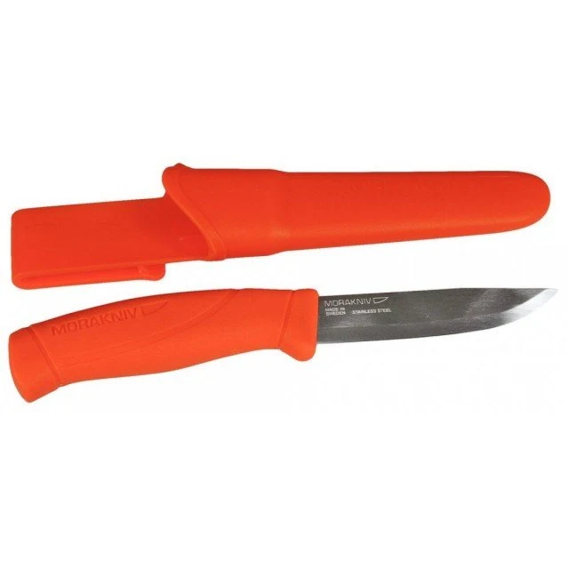
A Mora kések egy Svédországi családi vállalkozásból származnak, ahol a késművészet és a késkészités nemzedékről nemzedékre öröklődöt. A Mora kés már több mint 300 éves múltra tekint vissza ez alkalommal a Mora rengeteg elégedett kés tulajdonost talált magának itthon és világszerte. Minden Mora kés kiváló vágási tulajdonságokkal rendelkezik hála a skandináv megdolgozásnak, mely még ma is a legmegfelelőbb típusú élezések közé tartozik. A kések él kialakítása az ősi skandináv szalagél elvén történik, mely egyenes, töretlen vonalban halad az élig. A Mora kések gyártásánál Sandvik 12C27 rozsdamentes acélt használnak amely 57-58 HRC-re edzett, és szénacélt amely 59-60 HRC-re edzett, továbbá Triflex szénacélt, melynek keménysége 58 HRC, avagy nagyon kemény szénacélt melynek keménysége akár 61 HRC. Egy Mora kés tökéletes választás azok számára, akik minőségi késre vágynak kiváló vágási tulajdonságokkal, megfizethető áron.
Értékelések
Még nincsenek értékelések.